Thank you, Alberto Cairo and Robert Grant
by Sam Savage

Datasaurus Arithmetic

Data set HAP and PY
The three great milestones of manned flight were the Wright Brothers in 1903, the lunar landing in 1969, and the lithium ion laptop battery of the 1990s. This last breakthrough allowed me (while buckled into an airline seat to control my ADD) to develop a data set to dent the steam-era concept of correlation. I was on a flight from the East Coast to San Francisco, and over Denver I reached my goal: two variables, called HAP and PY, which had zero correlation, but nonetheless displayed a clear interdependency, as shown.
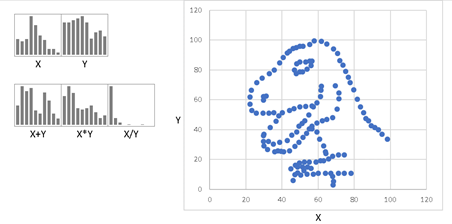
As I mentioned in my earlier blog on Virtual SIPs, I am not the only one poking fun at statistical concepts with ridiculous scatter plots. Alberto Cairo, a professor of Visual Journalism at the University of Miami, has a downloadable data set called Datasaurus, which has several X,Y pairs of data points, with identical summary statistics and correlation, but wildly different scatter plots. Alberto created his masterpieces with an interactive tool called DrawMyData from data scientist Robert Grant.
Never one to leave the bizarre well enough alone, I could not resist creating a model called Datasaurus Arithmetic, in which you may perform SIPmath calculations on the various patterns in Alberto’s dataset. Above we see the marginal distribution of X and Y (which I call Dino and saur), along with calculations involving the sum, product and quotient of X and Y while preserving the Jurassic joint distribution of X and Y.
If you teach statistics or data science, I urge you to download the file and compare the scatter plots and summary statistics of Alberto’s other included data sets.